How to Make Your Home Look More Put Together: Simple Interior Design Tips
Let the Everyday Dining Area Feel Considered
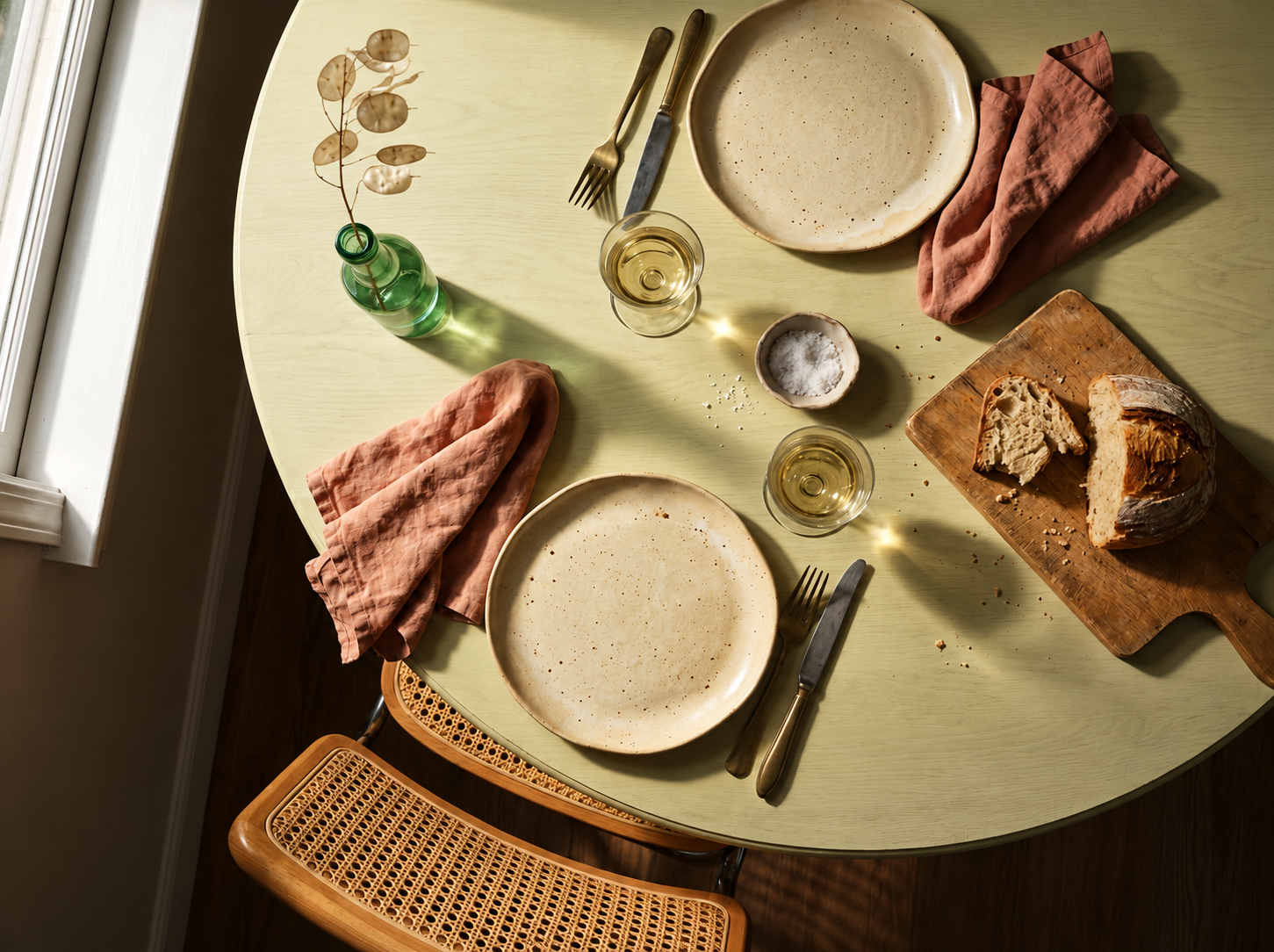
The dining area is one of those spaces that tends to absorb clutter slowly, without anyone really noticing. A pile of letters here, a candle that never gets lit, a fruit bowl that has become more of a dumping ground — and before long, the table has stopped feeling like somewhere you actually want to sit.
Bringing intention back into a dining space doesn’t take much. Clear everything from the surface first, and then return only what genuinely belongs there. One low arrangement of stems or a single candle holder is usually enough. The table should feel ready, not cluttered.
Chair placement matters more than most people account for. Chairs pushed fully under the table make the whole area read as closed and unused. Pulling them out an inch or two — just slightly — gives the arrangement a lived-in ease that photographs well and feels even better in person.
Key Points
Give a Statement Piece Its Own Presence
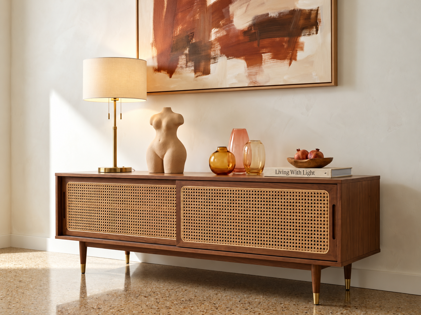
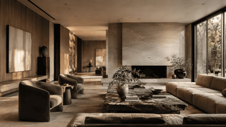
Every well-styled room tends to have one piece that does the talking — a chair in an unexpected fabric, an oversized mirror, a lamp with a genuinely interesting base. The problem is that most of these pieces get buried. They’re surrounded by too many other things competing for the same attention, and the whole room ends up feeling flat because nothing is actually landing.
A statement piece needs breathing room. That might mean moving surrounding furniture slightly to create a small zone around it, or clearing the wall behind it so the piece reads against a clean backdrop. It’s a simple shift, but it changes everything about how the room feels when you walk in.
Keep accessories around it quiet and low. If the chair is the statement, the side table beside it should be plain. If the lamp is the focal point, the surface it sits on should carry almost nothing else. Restraint around a strong piece is what allows the piece to actually be strong.
Let Organization Become Part of the Design
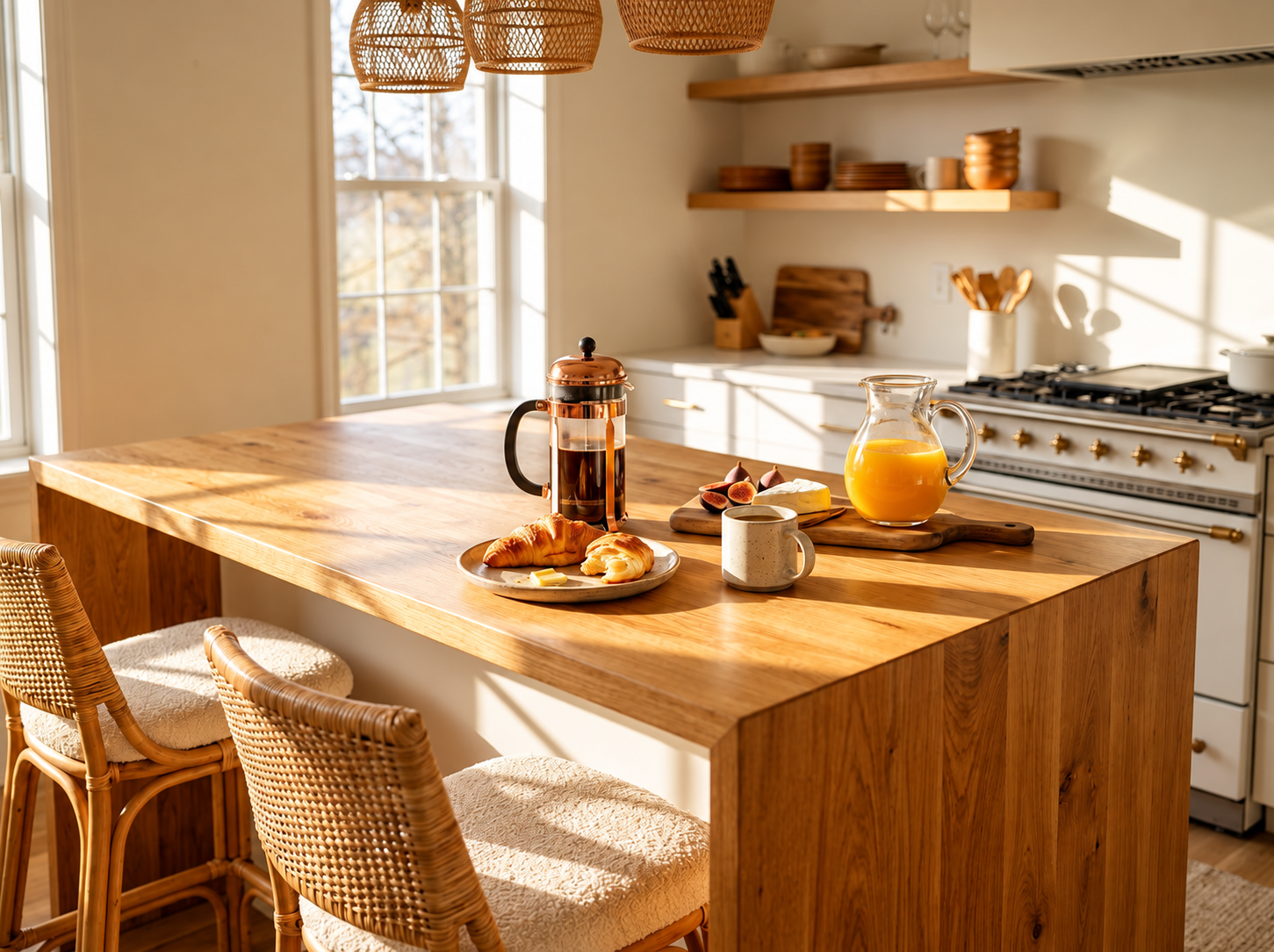
There’s a version of organisation that hides everything away and leaves a room feeling cold and unlived-in. And then there’s the version that treats the way things are stored as part of the design itself — and that’s the one worth working toward.
Open shelving is the clearest example. A shelf stacked randomly with books, cables, and miscellaneous items reads as chaos. The same shelf with books organised loosely by tone or height, one or two objects placed intentionally between them, and a small amount of empty space left deliberately — that reads as a home that has been thoughtfully curated.
Baskets, boxes with lids, and trays all do useful work here. They contain things that need containing while still feeling like they belong to the room. The key is choosing materials and tones that sit comfortably within the palette you’ve already established, rather than introducing something that visually clashes with everything around it.
Small Details Can Change the Whole Impression
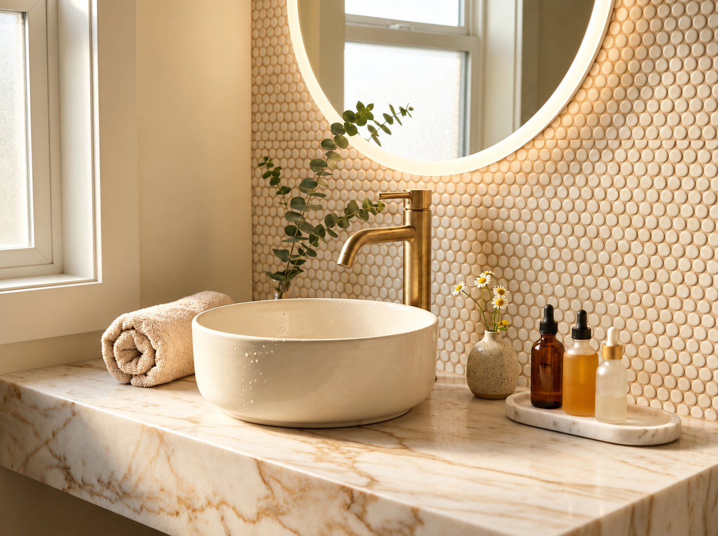
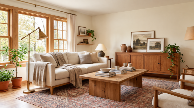
It’s rarely the large purchases that lift a room. More often it’s the small, considered details that no one can quite point to but everyone quietly notices. A linen cushion cover instead of a printed polyester one. A candle in a proper holder rather than a cheap glass jar. A throw folded cleanly over the arm of a sofa instead of left in a heap.
These are not expensive changes. They are simply attentive ones. The details that make a home feel more expensive are almost always the ones that signal care — that someone has noticed the room and made small decisions about it with real consideration.
Hardware is another area worth revisiting. Drawer pulls, cabinet handles, curtain rings — swapping tired or mismatched hardware for something consistent and well-made costs relatively little and changes the perceived quality of a piece of furniture considerably. It’s the kind of detail visitors rarely comment on directly but always register.
Turn Forgotten Corners Into Useful Features
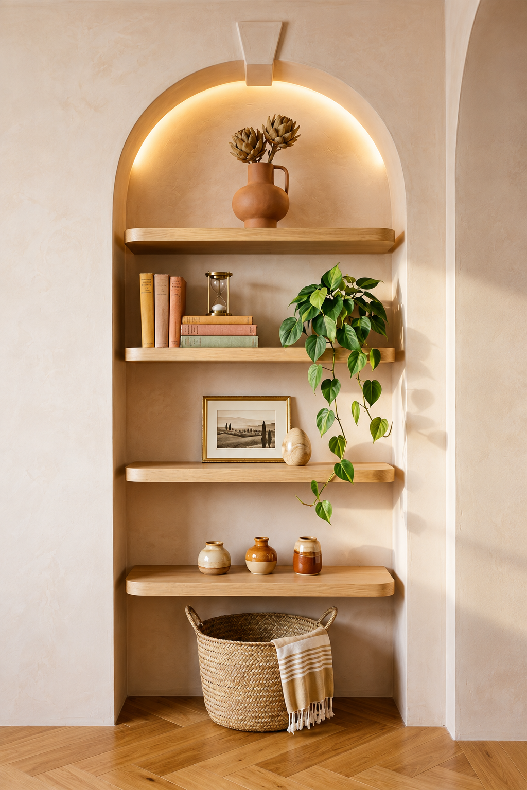
Most homes have at least one corner that has quietly become a holding zone — a chair nobody sits in, a floor lamp that doesn’t work, a plant that isn’t thriving. These spaces tend to get ignored precisely because they feel too awkward to deal with, but they’re often the easiest wins in the whole room.
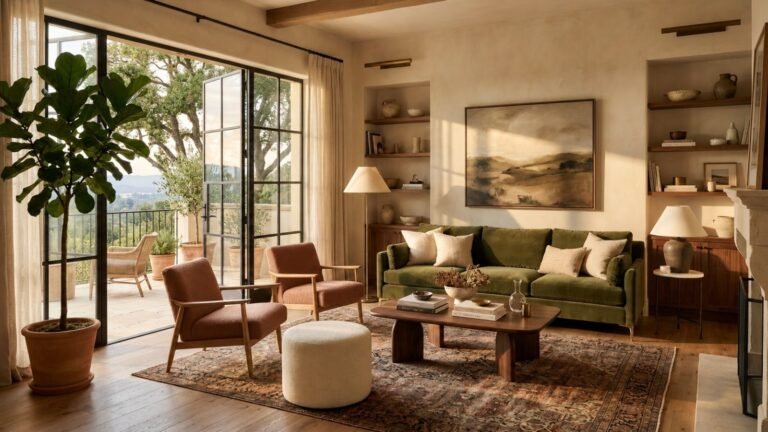
A corner with a good chair, a lamp at the right height, and a small table beside it becomes a reading spot. It creates a second point of interest in the room and draws the eye in a direction it wasn’t travelling before. Warm, layered corners are one of the simplest ways to make a room feel more complete and considered.
If a corner doesn’t suit seating, a tall plant often does the job just as well. Something with height — a fiddle leaf fig, a large olive, a simple eucalyptus stem in a tall natural-stone planter — fills vertical space naturally and gives the room a sense of life that softer furnishings alone rarely achieve.
Treat Storage as Part of the Interior
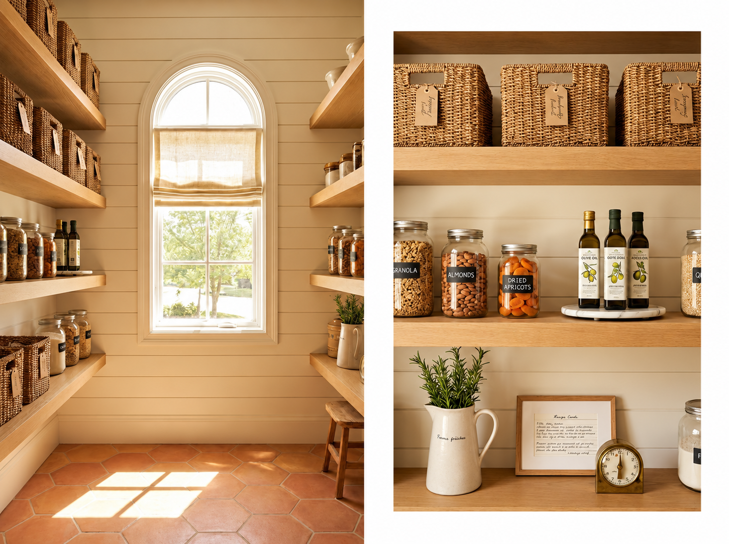
Storage that looks like storage — visible shelves stuffed to capacity, freestanding units that clearly arrived as an afterthought — always works against the overall feel of a room. The rooms that look most considered are the ones where the storage has been folded into the design so naturally you barely register it as storage at all.
Built-in shelving painted to match the wall is the classic example. The unit disappears into the architecture and what you see instead are the objects displayed on it. A similar effect can be achieved with freestanding pieces if the finish, scale, and placement are chosen to work with the room rather than simply fit inside it.
Homes that feel genuinely expensive and well-designed always have storage that has been considered from the beginning. The practical and the aesthetic aren’t treated as separate concerns — they’re solved together. That’s the standard worth working toward, regardless of budget or room size.
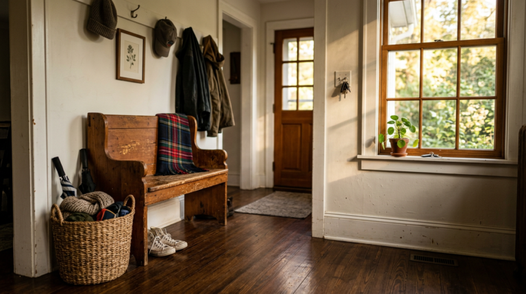
Even something as modest as a lidded box on a console table, or a woven basket tucked beneath a bench, reads as intentional when the material and tone are right. It’s not about perfection. It’s about making the things that need to be there feel like they belong.
Frequently Asked Questions
Start by clearing the table completely and only returning what genuinely belongs there. A single candle, one small arrangement, or a simple tray is usually sufficient. Chair positioning and a pendant light hung at the right height do a great deal of the styling work without any additional cost at all.
Space around it. A statement piece that is crowded by other furniture or accessories loses its ability to be noticed properly. Clearing the immediate area around it, keeping surrounding objects quiet and low, and giving the piece a clean backdrop — that’s what allows it to actually land in the room the way it should.
Remove at least a third of what’s currently on the shelves — more if you can. Group books loosely by tone rather than size alone, and place one or two objects deliberately between the groups. Leave visible empty space on at least one shelf. The restraint is what makes the rest of it feel curated rather than simply accumulated.
A chair, a lamp, and a small side table is the most reliable formula. It creates a second point of focus in the room and gives the corner a clear purpose. If seating doesn’t suit the space, a tall plant in a considered vessel achieves something similar — it fills the vertical space naturally and brings the corner into the room rather than leaving it disconnected from everything around it.